These posters are, essentially, my humble attempt to practice with Illustrator and photoshop. Any successful design work is purely accidental.
The Cry of the Owl (1987)
My poster based on the Chabrol film based on the Highsmith novel based around voyeurism and societal decay. This poster utilizes one of my greatest design secrets: the circle!
1917 (2019)
My poster for 1917, a film I have not watched, nor do I have much desire to see, though I get the basic gist of the plot and the single take element. I attempted to display that limited knowledge in the poster.
The Irishman (2019)
The Irishman allowed a beloved American icon to return to the silver screen for the first time in many years. I speak, of course, of the American roadside institution Stuckey’s.
The Lighthouse (2019)
This poster kind of refers to the overt phallic elements of the lighthouse in the film and plays with the censorship of potentially vulgar or stimulating visuals. So in the spirit of our times…I covered it up with some tape. All posters should be so easy.
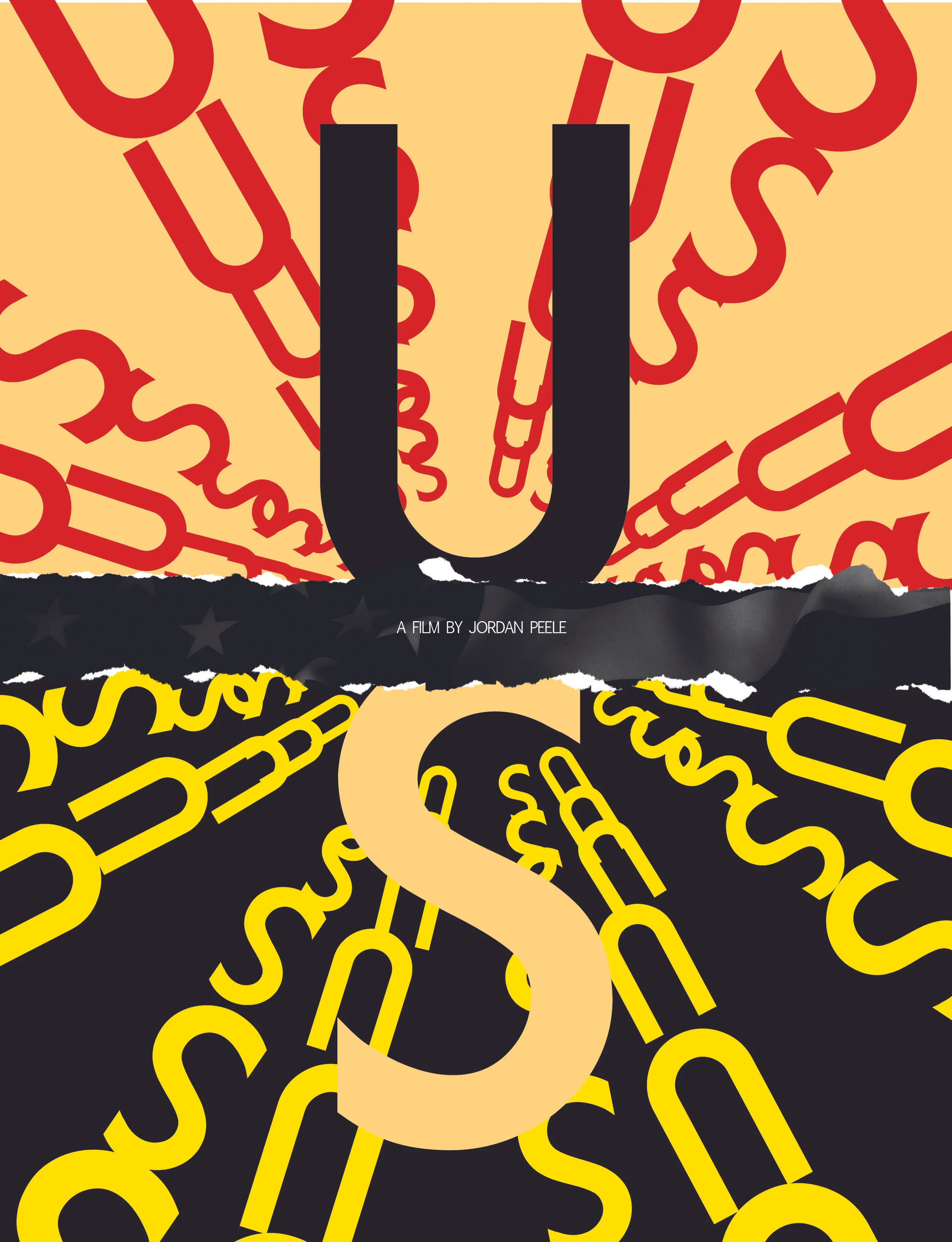
Us (2019)
This poster for Jordan Peele’s Us, was essentially an attempt to make something resembling, oh so vaguely, the amazing silent film posters made in pre-Stalin Soviet Union. Yeah, didn’t really turn out like that.
Once Upon A Time In…Hollywood (2019)
Yeah, I don’t really know what I’m doing, as exhibited here, in this poster for Once Upon A Time In…Hollywood. Looks more like a dumb paperback you’d ignore at the Strand then a movie poster. No but actually I’m a great designer. You should hire me for any position available.
Riley the Cop (1928)
I picked a silent film so it would be harder to judge how good or bad the poster is. Basically this was my attempt to include the title of the film (“Riley the Cop”), the fact that it was a film (“a film by”), and to let the viewer of the poster know the name of the director of the film (“John Ford”). I hope these elements came through in the final product. I made the questionable decision of choosing fonts too small to read, I do not stand behind this.
Pain and Glory (2019)
Another classic, Almodóvar did it again. This poster has almost nothing to do with anything related to the movie…or does it? No, it doesn’t.
Uncut Gems (2019)
Looks less like a black opal and more like an egg. Whoops. My worst poster?
TRANSIT (2018)
Poster for Petzold, master of the modern political parable. My worst poster?
Richard Jewell (2019)
The best movie of the 2010’s was also the best movie to feature cookies and an adult man who loves his mother. This poster design represents my desire to show just that.


